This year the Heartstone Journey website comes into it’s 5th year. I don’t tackle a redesign every year, but I do try my best to switch things up for my readers by keeping the site fresh and relevant. Because of these thoughtful redesigns, I’ve continued to receive great feedback and the Heartstone community has grown because of it.
There was intentional design time in the new crisp images on the home page and major adjustments to lots of lines of CSS/PHP code, but getting more comfortable with the WordPress space, these redesigns are taking me less time.
Since 8Bit decided to close up shop back in 2013 and kick the Standard Theme over to Woo Themes, I began looking for a new theme platform. Spent many hours researching and finally landed on the Genesis Theme platform from Studio Press and it was definitely the right decision. If you want to create a beautiful website without all the crazy effort, I highly recommend starting with one of the themes from Studio Press gallery — it’s the framework that powers this website and the only one I recommend. I started out with the Remobile Pro theme and decided to move to the Altitude Pro theme.
Intentionality
This year I thought it was time for a major face lift of the site; to create a better experience for the reader with easier navigation, better imagery and crisper typography across all devices. And I think it’s really made a difference. I believe that a website should stay on message and tell a great story. When I began the redesign it was important to stay on my message and do my best to continue to communicate it to my tribe. Old and new!
I can’t tell you how important it is to be intentional and take a deeper dive on design choices. I’ve been growing my tribe and building the Heartstone brand with this in mind over the past 5 years. The right choices take time and the redesign is very cool, but I decided to bake simplicity into the mix. Heartstone Journey is a gathering place for people who want to live courageously from their hearts, a place of vision and perspective, thought provoking articles, helpful resources and inspiration for living life to the fullest. So any design choices I made had to be tribe-focused, clutter free and visually engaging.
Typography
Typography is probably one of the most important design choices you will make for your website, because its what people will read. Like all the Genesis themes, Altitude Pro, has a beautiful typography making the reading experience a pleasure. It looks stunning when reading from a laptop or your favorite mobile device.
For this redesign, I was very specific about the typefaces I chose for better readability and visual rhythm. After some research and feeback, I decided the best reading experience for my tribe would be to use the default font typeface Ek Mukta with a size of 28px, weight of 200px and line height of 2…to ensure readability across multiple devices.
Calls To Action
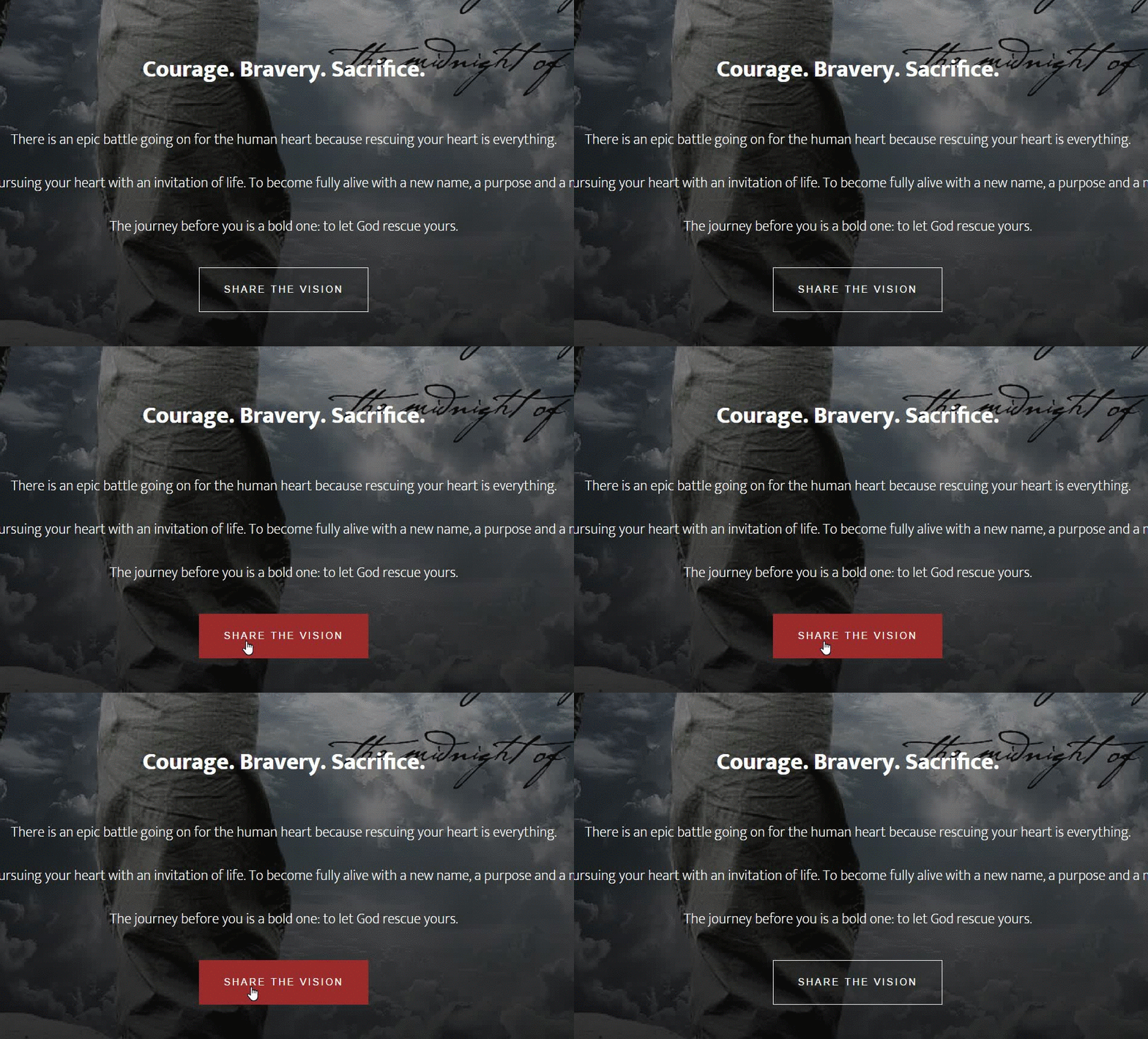
Life is a verb and I wanted the story of Heartstone Journey to be nothing less. Calls to action should pop and make it obvious that they are interactive. So when I created the new buttons there is a consistent hover effect across the site. When you navigate your mouse over these “calls to action”, they change showing you that they’re interactive. Looks like this:

I hope these new hover effects pop, so let me know if these inspire action.
The Epicenter
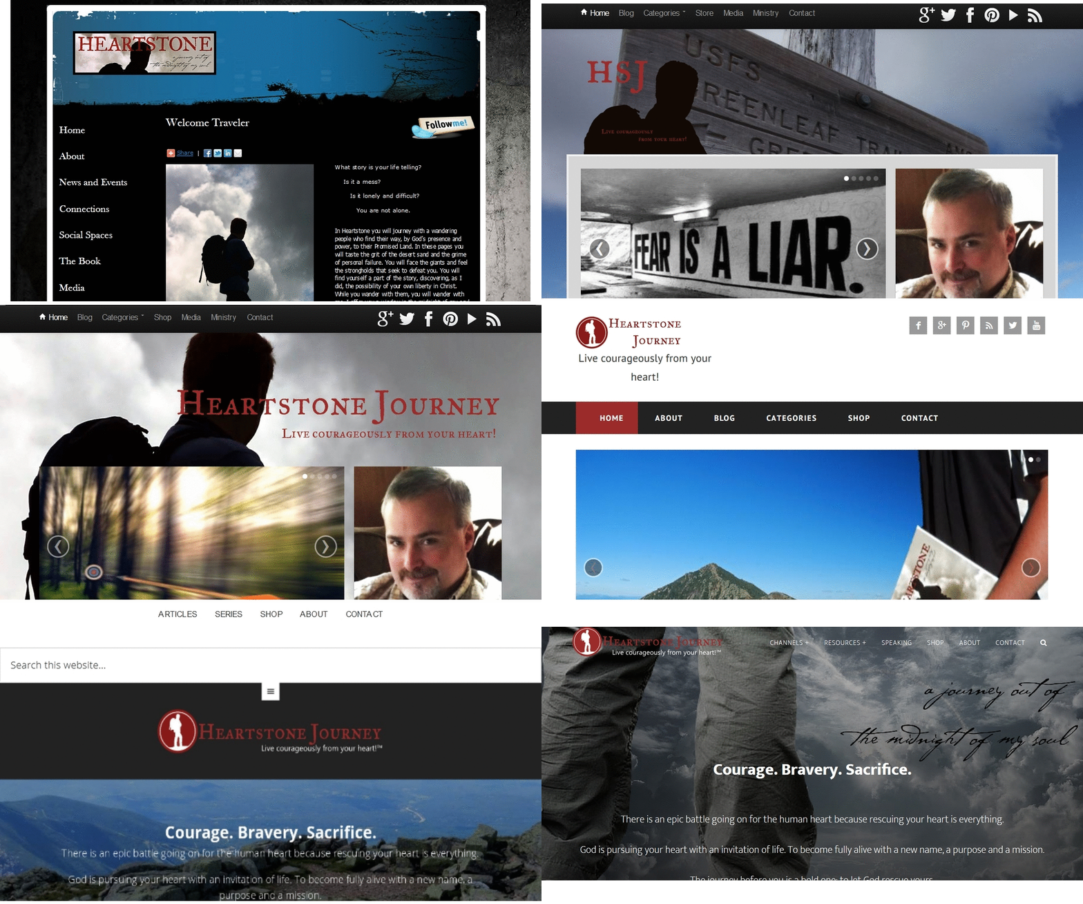
The home page for Heartstone Journey has gone through an evolutionary transformation since I kicked it off back in 2011. When I jumped into the blogosphere I had no featured content areas, no visibly stunning images and my writing was still evolving as I was finding my voice. I really didn’t know what I was doing at all, but it didn’t stop me from bush whacking and blazing my trail.
Here is a quick history fly by…

Most blogs are well just that…a blog. I wanted my home page to be that tribal campfire experience that really grabbed my reader and not just that first page of a blog. Of course people get slingshotted right onto one of my articles (blog post) by a social link, search result or an email that I send out if your on my list. For those who happened to discover and land on the Heartstone Journey home page as their first touch point, I wanted to capture them with the power of story.
I restructured the navigation experience to provide the reader with intuitive signposts to orient them to every corner of the Heartstone Journey experience. I also added an animated search function with the power of Google. If you want to add this cool search animation to your site head over the tutorial written by Sridhar Katakam. With some styling tweaks, the new search was Heartstone ready.
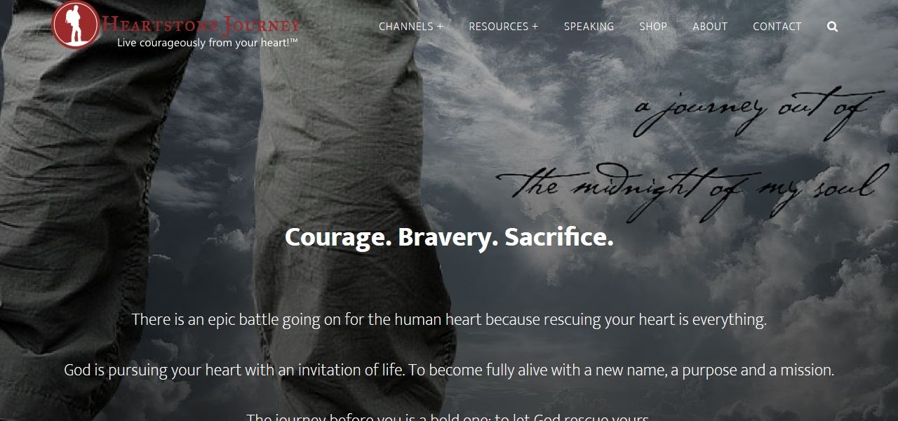
In this newly redesigned version, I’ve made the home page entirely about the story of Heartstone Journey…even if you haven’t read the book. I’ve also included some legit community proof to show some credibility — to cut through all the noise out there. Check out my ‘About’ page or LinkedIn profile for a deeper dive on credibility.

Oh, by the way, even though I’m right “here” on the Heartstone Journey evolution timeline…this will always be a work in progress.
The Articles (Blog)
There’s now so many places to explore here on Heartstone Journey but the motivating articles are one of the cornerstones here on Heartstone Journey. I’ve really focused on ensuring that the reader’s experience has the most freedom possible with eye popping images that set the context for each article. I’ve been writing for many years and you will notice the connectedness with every article I publish. Also, take the time to check out the updated series section of the site because sometimes a single article just isn’t enough to cover a topic. It’s not Amazon, but I’ve also redesigned the shopping experience so check it out.
Mobile Responsive
As the Heartstone Journey experience evolves, the mobility experience evolves too. I have always tried my best to offer a great experience across all devices because more than 85% of my traffic comes from a mobile device. With this redesign, I baked in more time to go through just about every page on multiple mobile devices looking for all the problem areas and adjusted them accordingly. If I missed anything, please let me know.
Heartstone Journey has never been more attractive on mobile devices than it is after this face lift.
Bringing It All In
Keep on the look out for Heartstone Journey to evolve as I too am constantly learning and evolving. I hope this article was informative, provided some insight into my though process as well as the inspiration on how I approached things for the site face lift. Remember…your writing and web design all work together to tell your story, so how you’re telling that story is everything in creating the brand you want your tribe to get excited about.
Storytelling is the most powerful way to put ideas into the world today, but storytelling has always been the best tool to communicate ideas and capture the imagination of others. My tribe has told me (and I believe) that this redesign kicks @$$, but instead of me trying to convince you, I’ll let you decide as you walk through the new story oriented site. Believe in what you do, do what matters, and do it with love!
Explore and let me know what you think.
Base image credit: Pixaby. Free for commercial use.
